
You’re wrapping up a professional proposal. Everything looks solid. Then you hit send—but you missed something.
You wrote “Please see the aerial photo attached” when you meant “Check the document formatted in Arial.” The client pauses. They’re quietly wondering if you actually proofread anything. That small mistake just planted a seed of doubt about your competence.
Here’s the thing: mixing up Arial and aerial isn’t just a grammar slip. It’s a credibility signal. One word tells people you understand design and precision. The other tells them you rushed. And in professional settings? People notice. Whether they say anything or not.
🎯 Quick Answer Box:
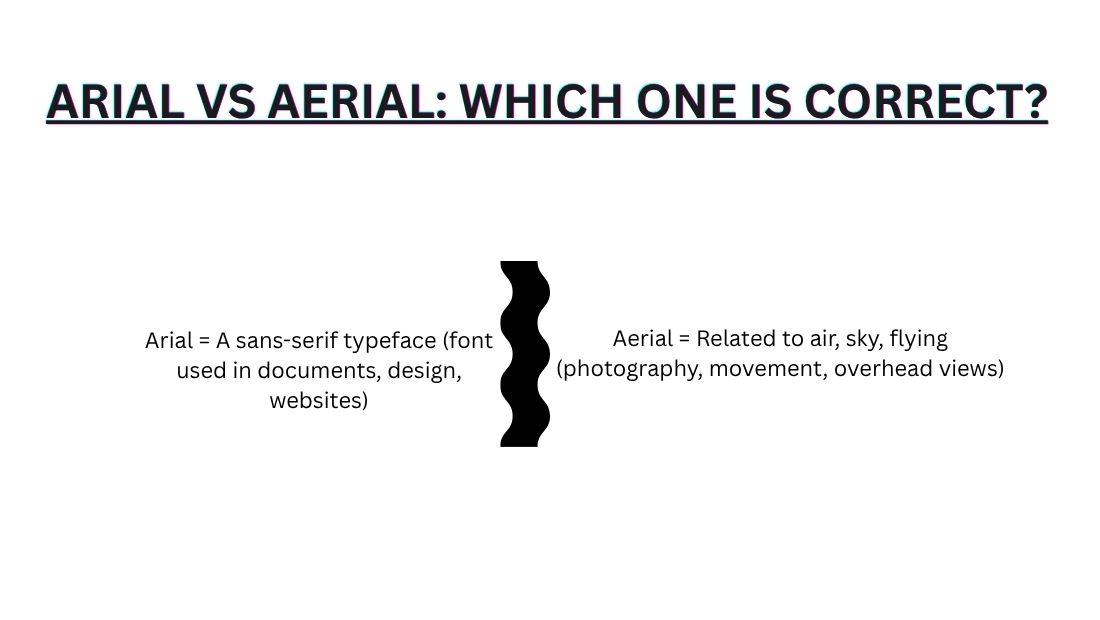
- Arial = A sans-serif typeface (font used in documents, design, websites)
- Aerial = Related to air, sky, flying (photography, movement, overhead views)
The Neuroscience of Confusion
This isn’t a stupid mistake you’re making. Your brain is actually wired to confuse these words.
Both Arial and aerial sound completely identical. When you hear them spoken, your brain processes the sound first. It doesn’t carefully check spelling—it looks for meaning from context. This is usually helpful. Right now? It’s working against you.
Your visual system does the same thing. When you read fast (which most of us do), your brain doesn’t read every letter. It recognizes word shapes. Arial and aerial are almost the same shape. Your eyes skip over the difference because your brain “expects” one or the other based on what you’re writing about.
Why Your Brain Mashes These Words Together
The Phonetic Similarity Trap
Both words sound like /ˈɛəriəl/. When you dictate to Siri, Google Assistant, or Alexa, they hear the sound and have to guess which word you meant. They’re not smart enough yet to catch context perfectly.
Real situation: You’re driving and dictating an email. You say “Make sure you use Arial font for the headers.” Siri transcribes it as “aerial.” You don’t catch it before sending. The designer gets confused. Wasted time ensues.
This happens constantly with voice-to-text. The AI defaults to the more common everyday word (aerial, because drones and photos are everywhere). It misses the specialized design term (Arial).
The Visual Pattern Recognition Trap
A-e-r-i-a-l and A-r-i-a-l. Only two letters swap positions. Your eye skips right over it when reading fast.
This is why spellcheck can’t catch it. Both are valid dictionary words. Spellcheck looks for spelling errors, not word choice mistakes. Your brain fills in what it “expects” to see based on context, not what’s actually written.
Contextual Blindness
Reading about fonts? Your brain auto-corrects to Arial. Reading about drones? Your brain auto-corrects to aerial. We don’t consciously read every letter—we recognize word shapes and patterns.
Native English speakers mess this up way more than non-native speakers. Why? Non-natives read more carefully because they’re not skipping ahead. They actually look at the letters.
The takeaway: Awareness helps. When you know this happens, you slow down. Speed kills precision. Intentional pausing catches mistakes.
Arial Decoded: The Font Deep Dive
Arial is literally everywhere. You’re probably reading it right now on multiple devices.
If you work in design, tech, business, or any professional field, you need to understand this font inside and out. It’s not glamorous. It’s not trendy. But it runs the world.
The History of Arial: More Than Just a Font
Arial was created in 1982 by designers Robin Nicholas and Patricia Saunders at Monotype. Here’s why it matters: Helvetica was the king of fonts at the time, but it was expensive and proprietary. Arial was designed as a metrically compatible alternative—same proportions, different name, no licensing fees.
Then everything changed. Microsoft bundled Arial with Windows in 1992. Suddenly, every computer that shipped had this font. Designers didn’t have to pay for it. Developers didn’t have to load custom fonts. Arial became the default.
Fast forward to 2024: Arial is still the most widely used sans-serif typeface globally. It shaped how the entire internet looks.
Why Arial Is Default in Microsoft & Business
Web-safe: Works on every device without loading custom fonts. No delays. No broken designs.
Accessibility: It’s highly readable for people with dyslexia. The letterforms are open and clear. No weird quirks that confuse the eye.
Professional perception: Using Arial signals “serious business,” not creative or playful. Banks use it. Law firms use it. Government agencies use it.
Consistency: You know exactly what you’re getting across devices and platforms. No surprises. No font substitution errors.
Speed: Modern web design is obsessed with performance. Custom fonts add load time. Arial is already installed. Done.
Compliance: Some industries mandate Arial for contracts, legal documents, and official forms. The government sometimes requires it.
When to Use Arial (And When NOT To)
✅ Perfect For:
- Professional reports, resumes, and CVs
- Business emails and formal letters
- Academic papers (many universities require Arial)
- Government and legal documents
- Corporate branding (IBM, Microsoft)
- Websites designed for clarity over aesthetics
- Accessibility-first designs
- Documentation and technical writing
❌ Avoid When:
- You want brand personality and distinctiveness
- Design-heavy projects (choose something more interesting)
- Creative industries often pick Helvetica instead (more prestige)
- Children’s books, artistic projects
- Fashion and entertainment brands
- Anything trying to stand out visually
Font Alternatives to Arial
If Arial feels too basic, try these:
- Helvetica: More expensive, more prestigious, basically the same (almost)
- Calibri: Softer, more modern, Microsoft’s newer default
- Verdana: Friendly, web-safe, slightly rounder
- Tahoma: Narrow alternative, good for tight spaces
Here’s the real talk: Arial is the reliable middle child of fonts. It’s not exciting. It’s forgettable. But you can always count on it. It’s the typeface equivalent of showing up on time and doing the work.
Aerial Decoded: The Air/Sky Deep Dive
Aerial isn’t just a grammar nerd’s favorite word. It’s exploding in modern usage.
With drones, satellites, and overhead cameras everywhere, aerial is more relevant in 2024–2025 than ever before. The word went from technical jargon to everyday vocabulary in less than a decade.
Etymology: Understanding the Root
Aerial comes from Latin aerius, meaning “of the air.” Same root as aeronautics, aerospace, and aerodynamics. Remember that: aer- means air.
This makes it stick. When you see the word aerial, think “aeroplane” or “aerospace.” Not “font.”
The Three Core Uses of Aerial (Real-World Breakdown)
#1: Photography & Videography
The drone explosion happened. DJI, GoPro, consumer drones made aerial footage accessible to everyone. Real estate agents now show properties from above as standard. Media outlets use aerial shots to show scale and context.
Search data proves it: “Aerial photography” searches jumped 156% from 2022 to 2024. This isn’t slowing down.
Why? Aerial views show scope. They answer questions instantly. “Is this neighborhood busy?” Drone shot answers it. “How big is the property?” Aerial shot shows it. “What’s the damage from the storm?” Aerial view reveals it.
Instagram and TikTok flooded with drone content. Gen Z expects aerial views as part of visual storytelling. If you’re a real estate agent, travel vlogger, or content creator without aerial footage? You’re behind.
#2: Movement & Acrobatics
Gymnastics has aerial flips. Cirque du Soleil has aerial performers suspended in air. Stunt coordinators film aerial maneuvers. Skydivers perform aerial tricks.
Contemporary dance uses aerial silks and rigs. The fitness industry exploded with aerial yoga. People pay good money to hang from silks and perform mid-air exercises.
Why does this matter for your understanding? These uses show that aerial describes things happening in the air, not things visible from the air. A gymnast doing an aerial flip is in the air. An aerial view is taken from above.
#3: Equipment & Installation
TV aerials. Radio aerials. Antennas. In British English, “aerial” is the standard word for TV antenna. Americans say “antenna,” but “aerial” isn’t wrong—it’s just regional preference.
Cable cars suspended on aerial cables. Cranes lifting equipment via aerial platforms. Utility companies stringing aerial power lines. Engineers design aerial systems constantly.
In technical writing, you’ll see “aerial support,” “aerial transmission,” and “aerial equipment.” It’s precise terminology.
Why Aerial Usage Is Exploding
The drone industry hit $2+ billion in 2024. Growing 15% annually. Insurance companies use aerial assessments for damage claims. Real estate companies use aerial imaging as standard. Construction companies map sites with drones.
Every YouTube travel vlogger uses drones. Every real estate listing now includes aerial shots. Environmental scientists monitor climate using satellite aerial imagery. Governments use aerial mapping for urban planning.
Aerial went from specialized to mainstream. And that change happened fast.
The Confusion Matrix: Real Consequences
Here’s where theory meets reality. These aren’t hypothetical—they’re actual mistakes that damage credibility.
Real-World Examples by Context
| Context | ❌ WRONG (Loses Credibility) | ✅ CORRECT (Professional) |
| Resume/CV | “Designed website using aerial typography principles” | “Designed website using Arial typography” |
| Real Estate Listing | “Beautiful aerial view of the city from your windows” | “Beautiful aerial view of the city from your windows” |
| Design Proposal | “Insert your aerial footage here” | “Insert your footage here” |
| Email to Designer | “Can you use that aerial font you mentioned?” | “Can you use that Arial font you mentioned?” |
| School Report | “The aerial image uses Arial font for labels” | “The aerial image is labeled with clear typography” |
| Social Media Caption | “Finally got that perfect aerial screenshot in Arial!” | “Finally got that perfect aerial screenshot!” |
| LinkedIn Post | “Launching our new aerial photography service” | “Launching our new aerial photography service” |
| Contract | “All documents must be formatted in aerial” | “All documents must be formatted in Arial” |
Industry-by-Industry Damage Assessment
🔴 Design & Creative — CRITICAL RISK
You submit a design brief. It says “aerial font.” The client sees it. They immediately question whether you actually know design. You’ve signaled incompetence before they’ve even seen your work.
Real consequence: Lost projects, damaged reputation. Designers catch this instantly. Your credibility evaporates.
🔴 Real Estate — CRITICAL RISK
Your listing description says “Arial view” instead of “aerial view.” Buyers searching “aerial views” on Zillow don’t find your property. You’ve sabotaged your own listing.
Plus: Property descriptions are supposed to be professional. This error makes you look unprofessional. Serious buyers question your competence.
🟡 Tech/Startups — MEDIUM RISK
You post in Slack: “Using aerial font for dashboard.” The team notices. Maybe they laugh. Maybe they make it a running joke. It doesn’t tank your job, but you become “the arial person.”
Real consequence: Subtle credibility dent, team perception shift.
🟡 Academia — MEDIUM RISK
Your essay says “The aerial view demonstrates Arial typography.” Teachers mark it. You lose a grade or two for confusion. Not catastrophic, but avoidable.
Real consequence: Points deducted, looks careless.
🟡 Professional Writing — MEDIUM RISK
Your blog post mixes them up. Readers notice. They question your authority. One mistake plants doubt.
Real consequence: Undermined authority, reduced trust.
🟢 Social Media (Casual) — LOW RISK
Instagram caption: “That aerial font is gorgeous.” Most followers don’t notice. Context is clear enough. But if you’re positioning as an expert? It looks sloppy.
Real consequence: Minor perception hit if you’re building a personal brand.
Platform-Specific Warnings: Where It Hurts Most
Not all platforms punish this mistake equally. Here’s exactly where it costs you.
🔴 LinkedIn (Professional Disaster Zone)
LinkedIn is permanent. Searchable. Part of your professional record.
You post a design tip mentioning “aerial font.” Designers in the comments immediately correct you. Your authority evaporates. Other recruiters and clients see the thread. The post becomes evidence you don’t know your field.
Real impact: Lost job opportunities, client inquiries tank.
Why it’s worst here: LinkedIn isn’t casual. It’s your professional reputation. One mistake gets amplified by comments and shares.
📧 Email (Professional Context)
Email is one-on-one. The recipient reads carefully.
You send a job application saying “Formatted my portfolio in aerial.” The hiring manager notices. They check every word after that. You’ve signaled carelessness in your very first communication.
For client emails: Mention “arial photography service” when you mean aerial. The client questions whether you proofread at all. They wonder if you understand your own business.
Real impact: Application rejected, client walks away, never knowing why.
Why it matters: Email is formal. People expect professionalism. One mistake destroys that perception instantly.
📱 Instagram/TikTok (Looks Sloppy, Not Critical)
These platforms are casual. Gen Z doesn’t harshly judge grammar.
Caption says “That aerial view filter in Arial aesthetic.” People understand from context. A few creators might notice. Doesn’t kill engagement.
But here’s the catch: If you’re building a personal brand as a designer or creator? It looks unprofessional. If you’re teaching others? They’ll call you out.
Real impact: Minor credibility dent if you’re positioning as expert. Minimal impact if you’re just sharing.
💼 Resumes/CVs (Automatic Filter)
Your resume says “Proficient in Arial design and aerial photography.”
Hiring manager reads it. Flags it mentally: “This person doesn’t proofread.” Especially harsh for design roles. For writing/editing roles? Automatic rejection signal.
Real impact: Resume filtered out, you never know why.
📝 Formal Documents (Medium Risk)
Contracts, proposals, reports. If you’re sloppy here, clients take it seriously.
A proposal mentioning “arial analysis” signals lack of professionalism. Sets a bad tone for the working relationship. Makes your terms seem less important.
Real impact: Lost contract, renegotiation, bid dismissed.
💬 Slack/Discord (Low Risk, Actually Funny)
Team notices, probably makes a joke. Doesn’t damage professional credibility. Might actually humanize you.
Real impact: Zero, maybe brief roasting.
The Pattern: “The more formal + professional + design-focused the platform = the more this mistake costs you.”
The Voice-to-Text Nightmare: Modern Problem Nobody Talks About
Here’s a modern crisis: Voice AI always picks the wrong word.
You dictate to Siri, Google Assistant, or Alexa. And they choose aerial when you mean Arial. Every. Single. Time.
Why Voice AI Always Gets It Wrong
Voice AI relies on context. If you say “Use Arial font,” the AI should understand. But here’s the problem: Aerial appears in more everyday speech than Arial.
People talk about drones, flying, overhead views constantly. Aerial is common in conversation. Arial is specialized design terminology.
When the AI hears ambiguous audio, it defaults to the more common word. That’s aerial. It doesn’t understand you probably meant the font.
Test it yourself. Tell Siri: “Remind me to use Arial in tomorrow’s presentation.” Siri writes: “Remind me to use aerial.”
Real-World Voice-to-Text Failures
Scenario 1: Email Dictation
You’re driving. Dictating an email to a designer: “Make sure you use Arial font for the headers.”
Siri transcribes: “Make sure you use aerial font for the headers.”
You trust the transcription. Send it. Designer gets confused. Back-and-forth emails clarifying what you meant. Wasted time.
Scenario 2: Notes App
You tell Google Assistant: “Remind me to use Arial in tomorrow’s presentation.”
Google writes: “Remind me to use aerial in tomorrow’s presentation.”
Tomorrow you see the reminder. You’re confused about your own note. Lose time figuring out what you meant.
Scenario 3: Social Media Dictation
You’re filming TikTok. Dictating caption: “Shot this with an arial lens.”
App posts it. Comments section roasts you. You don’t catch it before publishing.
How to Prevent Voice-to-Text Failures
Always proofread voice transcriptions. This is rule one.
Spell it out: Say “Arial, A-R-I-A-L” to force correct transcription.
Use context words: Say “Arial font” not just “Arial.” Helps AI pick correct word.
Avoid dictation for technical writing. Type it instead.
Turn off auto-correct for specialized terms (some devices allow this).
Double-check before sending anything important.
Memory Anchors: Make This Stick
One memory trick doesn’t work for everyone. Here are five different approaches. Pick what works for your brain.
Method #1: The Phonetic Breakdown
Arial = Art/Alphabets (typing/fonts) Aerial = Aeroplane (air/flying)
When you see the word, mentally say the first syllable. Forces you to slow down and notice the difference.
Say both out loud three times. Your brain will lock it in.
Method #2: The Etymology Anchor
Arial = Related to letters, alphabets, typography
Aerial = From Latin aerius (meaning “of the air”)
Same root as aerospace, aerodynamics. Aer- = air.
Connect each word to one personal example: Think “Helvetica fonts” when you see Arial. Think “drones” when you see aerial.
Method #3: The Visual Anchor (Emoji)
Arial = 📄 (document, letters, text)
Aerial = ✈️ (airplane, sky, flying)
When you see “arial” in writing, imagine a document. When you see “aerial,” imagine a plane. Visual memory beats rule memory for most people.
Method #4: The Sentence Pattern Anchor
Create two “template sentences” you can recall instantly.
Arial template: “___ font” or “in ___ typeface”
- “Use Arial font”
- “Format in Arial”
Aerial template: “___ view/photography/footage” or “___ movement”
- “Aerial view”
- “Aerial photography”
- “Aerial performance”
When you write, check if your sentence matches the pattern. It becomes automatic.
Method #5: The Personal Anchor (Make It Yours)
Connect each word to YOUR life.
Arial example: Think of the last time you changed a font in Word, Canva, or Google Docs.
Aerial example: Think of the last time you saw a drone, airplane, or overhead view.
Personalization sticks better than generic examples. Emotional memory beats factual memory.
Method #6: The Consequence Anchor
Arial mistake = credibility hit (think: embarrassment at work)
Aerial mistake = confusion (think: reader doesn’t understand)
Negative emotions create stronger memory. When you pause to choose, remember the consequence.
Best Combination Strategy: Use Method #1 (phonetic) for quick reference. Use Method #3 (emoji) for social media. Use Method #5 (personal) for long-term memory. Alternate them so your brain stays engaged.
Interactive Checklist: Before You Write
Before you hit send, publish, or submit—run through this 30-second checklist.
Use this every single time you’re about to use one of these words.
Decision Tree
Question 1: Am I talking about something you can type or format?
- YES → Probably Arial (fonts, documents, design)
- NO → Move to Question 2
Question 2: Am I talking about something visual involving sky, air, or flying?
- YES → Definitely Aerial (photos, drones, flying)
- NO → Move to Question 3
Question 3: Can the thing I’m describing be touched or installed physically?
- Font → Arial (install on computers)
- Equipment/antenna → Aerial (physically installed)
Question 4: When I say this word out loud, does it make sense in design/typing context?
- YES → Arial
- NO → Aerial
Quick Reference Guide
✅ USE ARIAL WHEN:
- Specifying fonts (“Arial Bold,” “Arial 12pt”)
- Talking about typography (“Arial typeface”)
- Formatting documents (“formatted in Arial“)
- Design work (“Arial is too basic”)
- Microsoft/tech tools (“Arial is the default”)
✅ USE AERIAL WHEN:
- Photography/videography (“aerial shot,” “aerial footage”)
- Flying/height (“aerial view,” “aerial perspective”)
- Acrobatics/performance (“aerial flip,” “aerial act”)
- Equipment (“TV aerial,” “aerial antenna”) — especially UK
- Drones/satellites (“aerial drone,” “aerial survey”)
- Movement (“aerial maneuver,” “aerial ballet”)
🚫 RED FLAG PHRASES (ALWAYS WRONG):
- “Aerial font” — NEVER correct
- “Arial photograph” — NEVER correct
- “Arial view” — WRONG (unless you mean a view in Arial font)
- “Aerial typeface” — WRONG
One-Sentence Rule
“Ask yourself: Would a drone or plane do this? → Aerial. Does this involve letters/text? → Arial.”
Corrected vs Incorrect: Before/After Gallery
Study these real examples. Recognize the pattern.
Design Industry
❌ WRONG (Credibility Destroyed): “I specialize in aerial typography and brand design. My work focuses on aerial layouts that catch the eye.”
✅ CORRECTED: “I specialize in Arial typography and brand design. My work focuses on clean layouts that catch the eye.”
💡 Why it matters: Client immediately questions your design knowledge. “Arial typography” = common phrase. “Aerial typography” = you don’t know design.
❌ WRONG: “The website header uses an aerial font with custom aerial kerning.”
✅ CORRECTED: “The website header uses Arial font with custom letter-spacing.”
💡 Why it matters: Font terminology is precise. “Aerial kerning” isn’t a real thing. Looks like you Googled the terms.
Real Estate
❌ WRONG (Lost Buyer Interest): “Beautiful 3-bedroom home with Arial view of the mountains and city skyline. Check out the Arial shot in the photo gallery.”
✅ CORRECTED: “Beautiful 3-bedroom home with aerial view of the mountains and city skyline. Check out the aerial shot in the photo gallery.”
💡 Why it matters: Buyers searching “aerial view” won’t find your listing. Also looks unprofessional—they won’t trust property quality if description is sloppy.
Academic Writing
❌ WRONG (Grade Deduction): “The arial photograph in Figure 3 demonstrates clear aerial perspective using Arial font labels.”
✅ CORRECTED: “The aerial photograph in Figure 3 demonstrates clear perspective using labeled typography.”
💡 Why it matters: Confusing usage loses points. Shows you didn’t proofread academic work.
Tech/Startup
❌ WRONG (Team Slack Will Screenshot This): “Our new dashboard is built with Arial components and uses aerial data visualization.”
✅ CORRECTED: “Our new dashboard is built with clean typography and uses data visualization effectively.”
💡 Why it matters: Tech team catches this immediately. You become “the arial person.” Running joke for weeks.
Professional Marketing
❌ WRONG (Undermines Authority): “This report provides an aerial analysis of market trends using Arial data visualization.”
✅ CORRECTED: “This report provides comprehensive analysis of market trends using clear data visualization.”
💡 Why it matters: Reader questions your professionalism. “Aerial analysis” isn’t a thing. It’s just sloppy.
Aviation/Photography
❌ WRONG (Ironic): “The Arial photography service offers stunning aerial portraits using Arial drones.”
✅ CORRECTED: “The aerial photography service offers stunning overhead portraits using professional drones.”
💡 Why it matters: In the ONE industry where you should know the right word, using the wrong one tanks credibility completely.
Social Media/Content
❌ WRONG (Unprofessional if You’re an Expert): “Just launched my new course: ‘Aerial Photography Mastery.’ Taught using Arial design principles. 📸✈️”
✅ CORRECTED: “Just launched my new course: ‘Aerial Photography Mastery.’ Designed with clean typography and professional layout. 📸✈️”
💡 Why it matters: If you’re teaching others, they expect you to know this. One mistake loses enrollments.
FAQ: Your Remaining Questions Answered
Why does spellcheck fail to catch this error?
Both Arial and aerial are valid English words. Spellcheck looks for spelling mistakes, not word choice errors. I can’t understand the context. Modern grammar tools like Grammarly catch this better because they analyze sentence structure and meaning.
Can AI chatbots catch this mistake?
Inconsistently. ChatGPT, Claude, and Gemini catch it in detailed writing but might miss it in quick prompts. Grammarly AI catches it reliably. Always proofread AI-written content yourself. It’s not foolproof, especially for homophones.
Are there regional differences (UK vs US)?
Yes. British English uses “aerial” for TV antennas. American English uses “antenna.” Australians use “aerial” too. Arial (the font) is identical everywhere. When writing for international audiences, clarify context.
Does Gen Z actually care about this mistake?
On TikTok and Instagram DMs? Not really. On LinkedIn, portfolios, or if you’re positioning as an expert? Absolutely. It signals attention to detail. Gen Z respects precision, even casually.
Why do professional documents have this error so often?
Speed. People write fast, assume meaning is clear, and don’t give things a final read. Busier professionals = higher error rate. It’s a sign someone didn’t give something one final check.
I keep making this mistake—how do I stop?
Create an auto-correct rule in Word, Google Docs, or Slack. Set “arial ” (with space) to auto-replace to “Arial ” if you mean font. Use find-and-replace before publishing. Put sticky notes on your monitor.
Is this mistake a sign of being unintelligent?
No. Intelligent people make this error constantly. It’s a homophone trap, not a logic test. The fact that you’re reading this shows you care about precision. That’s what matters.
Which tool best catches this error?
Grammarly Premium is best. LanguageTool is solid and free. Microsoft Word’s built-in grammar checker misses it. Hemingway Editor doesn’t catch it. Sapling AI catches it sometimes. Recommendation: Use Grammarly for important writing.
Conclusion: Make Precision Your Superpower
We’ve covered history, neuroscience, the real consequences, and the fixes.
You know why this matters. You know exactly where it hurts most. You’ve got memory anchors that work for your brain. You have a decision tree in your pocket. You’ve seen the before/after examples.
Here’s the real takeaway: Mixing up Arial and aerial isn’t stupidity. It’s rushing.
Every mistake signals to readers: “I didn’t care enough to check this.” That’s the credibility cost. It’s invisible until it isn’t. Then suddenly people question your competence in everything you do.
Using the right word signals the opposite: “I care about precision. You can trust my work.”
That distinction matters more than you realize. In professional settings, credibility is currency. One small mistake costs you more than you know. But one careful check protects everything you’ve built.
Key Takeaways:
- Arial = Font (sans-serif typeface, everywhere, professional, default)
- Aerial = Air/Sky (photos, flying, movement, overhead views, antennas)
- They sound identical but mean totally different things
- Your brain skips over the difference—intentionally slow down
- One mistake doesn’t destroy you, but it signals carelessness
- Use the decision tree before you publish anything important
- Choose your memory anchor and stick with it
- Proofread one final time, especially in professional contexts
- Credibility is built on precision
Indulgent vs Sober: Understanding Meaning, Usage
Less Than or Less Then? The Definite Rule (with Examples)
Immerse vs Emerse: When to Use Each One in Writing
